Friday, 21 December 2012
Mock-up photo shoot
Tuesday, 18 December 2012
Model Choice
For the model of my R&B music magazine I have decided to use my friend Will Hales. Will is very fashionable and has a particular look about him that I think is suitbale for my magazine. I am looking forward to working with Will as I think he really understands the concept of my magazine and I think this will really help. I also think using a male will help because I do not have to do make-up and hair is not neccessarily hard to do. The clothing he wears just normally is very urban so I dont think ill have much trouble with clothing.
Decisions on colour scheme
After researching different fonts I have now started to look at different colour schemes. I have noticed that black, white and red are main colours of R&B music magazines so I have decided to almost replicate the colours in my magazine.
As you can see red, is a prominent colour in these magazines as it catches your eye. I think using red in my magazine will draw people to certain parts of my magazine, like the puff for example.
The black and grey will be the base colours, like for coverlines, to emphasises different points. And the red will act as the colour to draw attention to different competitions and puffs, etc. I am happy with my colours as I think they will work well together and help me create a successful R&B and Hip-Hop magazine.
Monday, 17 December 2012
Font's design and Name decision
Font idea's
For my R&B music magazine I have now decided to look at different names, I quite the name VOID but also the name CRANK. But after much deliberation I have decided to call it VOID, I think this name suits the genre of my magazine. So now i have decided the name i have looked at different fonts.
To create these fonts I used the website
I quite like fonts 1 & 3, I think they are both easy to read and clear. I think they would make a statement in the cover and really emphasise the name. Although with font 3 I think it could possibly look too much on the page, it may make the page look to busy and complicated to read. But I am going to try both fonts for the masthead and see which one I think looks best and is clear for the reader. Also, one common convention of R&B magazines is that the model usually covers part of the masthead, like this..
So I will take this into consideration when editing my masthead with my model. But I will need to make sure that my masthead is readable so people can see what it is called easily even though part of it is covered.
Tuesday, 11 December 2012
Magazine Layouts
Layout for my R&B and Hip-Hop
Now I have decided the genre for my magazine I have started to look at layouts from different magazines. I have taken inspiration from VIBE magazine and RAP-UP magazine. These have helped to understand what type of layouts to use and how they affect the reader in a positive way. Here are the layouts I have created for my Front cover, Contents page and Double page spread.
I have used typical codes and conventions for my front cover, the masthead is large and will catch the readers eye. Also the main image is very prominent in the cover, this will attract the reader to look more into the magazine. The main image will relate to the double spread so it needs to be eye catching and interesting so people will read it.
Here I have chosen to use a large picture, I think using a big picture is a common thing for R&B magazines. It focuses more on who the magazine is about than other things. So I need to make sure I have good images to attract the reader to my magazine. Using a competition puff will add another element to my contents page and also involve the reader in the magazine.
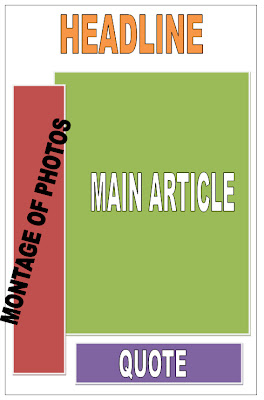
For my double page spread I have used a typical layout. I would like the montage of images to be in a camera strip, black and white maybe. I am also going to base the main article around an interview with a current R&B artist. I think this will allow me to create the main article quite easily because I can actually conduct the interview. I am happy with my layouts and I think I will be able to create my magazine fairly easily.
Wednesday, 5 December 2012
Questionnaire Evaluation
After deciding that my target audience will be males and females aged 16-19 I chose people to fill out my questionnaire to fit this criteria. From the results I complied these pie charts to represent the data.
Firstly I asked what was their preferred genre of music. As you can see in the pie chart Pop and R&B were the highest amounts. This could suggest why there are so many Pop magazines already out there. But could also suggest that there is a gap in the market for a R&B magazine as people enjoy that genre of music.
Secondly I asked what attracts you to buy a music magazine. The front cover is the highest amount, this includes the model and layout. So it shows I must focus on the front cover to attract my customers and catch their eye. But also not forgot about the main article and a suitable price for the my R&B magazine.
I also asked what type of things people would like to find in my magazine. I think this question will definitely help the most when creating my magazine. It will help me in the sense that I will already know what the public want before producing my magazine. As you can see Reviews and Articles on artists and bands are the highest scoring answers, so I will pay close attention to including these features in my magazine and making them of a good standard. I will include coverlines on the front cover that explain different articles in the magazine to make people want to buy my magazine.
And finally you can see I have asked what price they would pay for a music magazine. This question is crucial because I do not want to make the price to expensive so people will be put off buying it. I think if the price is between £3-3.99 I must include several entertaining features to really fulfil the audiences wants and needs.
Final decisions!
After collecting primary data for my magazine I have decided that my magazine will focus on R&B music, the main selling point will be my front cover and main article. It will be priced at £2.50 as I think this is a suitable price for the target audience. My R&B music magazine will be released every month and the demographic for my magazine will be both male and female teenagers 16-19 years of age. I think this demographic is well suited to society nowadays and more people are being introduced to R&B music which highlights a gap in the market.
Tuesday, 4 December 2012
Tuesday, 27 November 2012
Camera Angles for Music Magazine
To gather an idea of different camera angles for my music magazine I took some photos of different angles. I have explored some of the most common camera angles and thought about what type of affect it would have on the front cover of my music magazine.
Mid shot
Close up
Long shot
Low angle
Wide shot
Over the shoulder
Two shot
Monday, 26 November 2012
R&B and Hip-Hop magazine covers
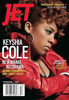
Here I have a few different magazine covers that have helped with inspiration for my music magazine. I have looked at colours and fonts that are common in this genre magazine. One main thing in common is the large image used on the front cover.
Music Magazine Analysis
After looking into a fashion magazine in detail for initial idea's I then moved onto a music magazine. I have analysed a magazine called VIBE, it is a R&B and hip-hop magazine. The magazine's target demographic is predominantly young, urban followers of hip-hop culture. This genre of magazine is what I would like to focus my music magazine on, so analysing it has helped me to under the conventions of this genre of magazine.
I have produced my analysis on Power point and uploaded it to SlideShare.com
Here is the link for my analysis - http://www.slideshare.net/maddieefaye/music-magazine-analysis-vibe
Tuesday, 20 November 2012
Magazine front cover analysed in detail
Using my magazine codes and conventions I analysed a fashion magazine in detail. I looked at why different colours were used and how the magazine apeals to the audience. This has helped me think about what type of things to think about when making my music magazine.
Monday, 19 November 2012
Codes and Conventions of magazine's
Purpose- to attract new and existing customers and make them want to buy the magazine.
Masthead- the name of the magazine, always at the top.
Tagline- near masthead, gives more incite about the magazine.
Central/main image- catches eye, bright colours, clothes reflect the magazine
Cover model- the person in main image (celebrity, pop group)
Anchorage- links text to picture
Secondary image- promote other features within the magazine
Coverlines- text on front cover, small snip its of stories inside
Mode of address- how to communicate with the readers, using personal pronouns, direct eye sight from model
Puffs- draws attention to specific element like freebies or competitions
Pugs- the 'ears' at top left and right of magazine, eg. price or date
Barcode- features price and edition number
Colour- usually consistent throughout magazine
Font- adapted for meaning, must be easily read- not messy
Monday, 12 November 2012
Plan for magazine
After finishing my preliminary task I have decided to make a plan to help me manage my time. I have created rough dates on when I need to start and finish certain tasks. I believe this is going to help me a lot because in the preliminary task I did sometimes not spend enough time or too much time on some things which then made me behind. So having a plan will hopefully make me on time to hand in my project. I have created a completed box that I will fill in after each task. I am going to keep checking my plan to ensure I am on time for everything.
Monday, 5 November 2012
Evaluation of my preliminary task - Making a front & contents page
First edit of my front page-
For my front page I used a template from Pages, I chose quite
a sophisticated template as I thought this would reflect my magazine well. I
continued to use this template but I changed the colours from green to blue as
I chose blue for my main colour. But after working on my front cover I decided
that I didn't actually like the template. The font didn't suit the target
audience, it was too formal. So I adjusted the font but then the font and the
whole look just didn't work. There were too many blank spaces on my front page,
this was making it look very amateur. So I researched some more about school
magazines and decided that my magazine needed to suit my audience. I added a
border around the page, just this simple adjustment changed the whole look of
my magazine. I am very happy with the change of my front cover, it is more
appropriate and overall just looks much more professional.
Final edit of my front cover
Final edit of my contents page
Luckily I started my contents page after i decided to change the whole look of my magazine. This made it very easy to create my contents page. I used a gradient fill for the background, it turns from a darker blue at the bottom to a lighter blue at the top, this just makes it a little more interesting. I also used an online font generator to create the font for 'Pop Quiz! Page 11', i chose to keep the same blue all the way through for consistently. I like this feature because i think it reflects what a real school magazine would have. The pictures i used had a small tag line which should interest the reader to read the full article. I think overall my contents page works well within my school magazine.
Wednesday, 17 October 2012
Making my logo
Process of making my logo
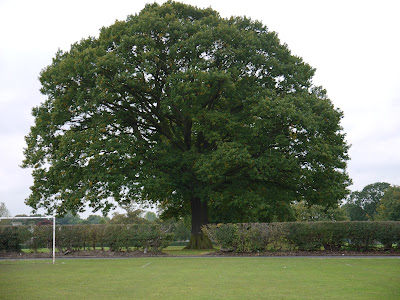
I decided for my school magazine that i wanted to create a logo that would represent Idsall. I chose the iconic symbol of the famous oak tree as the basis for my logo. So i went and took a photo of the oak tree.

I decided for my school magazine that i wanted to create a logo that would represent Idsall. I chose the iconic symbol of the famous oak tree as the basis for my logo. So i went and took a photo of the oak tree.
I was happy with my image apart from the goal post, so i used fireworks to edit it out. I used the rubber stamp tool to edit it out, i was successful in removing goal post and i think it looks far more professional now without it.
I then added a circle to the oak tree and removed the excess around the circle. Then i changed the background of the circle to green, i think my final logo works well within my magazine at it incorperates the colour green into my colour scheme.

Magazine front cover
For my preliminary task i have been creating a school magazine front cover and contents page. I have been making my magazine on Pages. I have I started off with a very plain front cover for my magazine, it was full of white spaces so i decided i needed to fill them.
First Edit
Final Edit
As you can now see my front cover has been changed quite considerably, there are far less blank spaces and i have included a logo that i made on Fireworks. I think my final magazine front cover works far better than before and looks from professional than my first edit.
Tuesday, 16 October 2012
Picture Editing
Choosing pictures for my school magazine
When choosing the pictures for my magazine i tried to select all sorts of different images that would represent my magazine well. When I took the picture it was quite a bleak day so the clouds were prominent in the picture. So using iPhoto i edited a photo of the school to make it look brighter and less miserable.
Before
The image looks very dark and cloudy.
After
The clouds have been lightened which has changed the whole mood of the image. The image makes the school look more appealing now, this image would work much better in a magazine.
Friday, 12 October 2012
School magazine Mood Board
This has helped me with inspiration for my school magazine. It is useful because I can gather idea's in one place.
Friday, 5 October 2012
Magazine cover research
This was my original mood board, I looked at magazine covers instead of the specific images used on them. Even though this wasn't the task set it did help me with inspiration for my magazine covers.
This is link to my Prezi.
http://prezi.com/3b_9n-d2kxqb/present/?auth_key=edh9adv&follow=j621g-xzl1s2
Tuesday, 2 October 2012
School Magazine research
Colour Scheme & Font- For my preliminary task I have been asked to create a school magazine. In preparation for making my magazine I have created a mood board to capture my idea's in one place. For my school magazine I have chose to use the colour blue as my main colour. I think blue is a professional colour and will work well in my magazine. I also need to think about a font to use, I think these 3 fonts are quite basic but they look professional which is the look i am going for. I want my magazine to be an easy read but full of interesting images.
Monday, 1 October 2012
School magazine research
School Magazines
Front page:-
- Logo of school
- Pictures of school or students
- Short information about an article (catches your eye, short, snappy)
Contents Page:-
- List of different pages divided in subs genres.
- Small pictures of things to come in the magazine.
Double page spread:-
- Articles about things happening around the school, eg. School prom or presentation evening
- Articles about sports achievements or sports awards evenings.
- Includes: pictures and bold titles
Subscribe to:
Comments (Atom)


