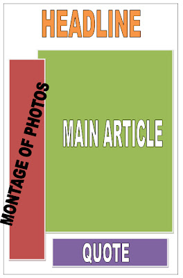
Layout for my R&B and Hip-Hop
Now I have decided the genre for my magazine I have started to look at layouts from different magazines. I have taken inspiration from VIBE magazine and RAP-UP magazine. These have helped to understand what type of layouts to use and how they affect the reader in a positive way. Here are the layouts I have created for my Front cover, Contents page and Double page spread.
I have used typical codes and conventions for my front cover, the masthead is large and will catch the readers eye. Also the main image is very prominent in the cover, this will attract the reader to look more into the magazine. The main image will relate to the double spread so it needs to be eye catching and interesting so people will read it.
Here I have chosen to use a large picture, I think using a big picture is a common thing for R&B magazines. It focuses more on who the magazine is about than other things. So I need to make sure I have good images to attract the reader to my magazine. Using a competition puff will add another element to my contents page and also involve the reader in the magazine.
For my double page spread I have used a typical layout. I would like the montage of images to be in a camera strip, black and white maybe. I am also going to base the main article around an interview with a current R&B artist. I think this will allow me to create the main article quite easily because I can actually conduct the interview. I am happy with my layouts and I think I will be able to create my magazine fairly easily.


No comments:
Post a Comment