Tuesday, 27 November 2012

Camera Angles for Music Magazine


To gather an idea of different camera angles for my music magazine I took some photos of different angles. I have explored some of the most common camera angles and thought about what type of affect it would have on the front cover of my music magazine.

 
Mid shot
 
 
Close up
 
 
Long shot
 
 
Low angle
 
 
Wide shot
 
 
Over the shoulder
 
 
Two shot


Monday, 26 November 2012

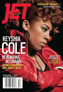
R&B and Hip-Hop magazine covers


Here I have a few different magazine covers that have helped with inspiration for my music magazine. I have looked at colours and fonts that are common in this genre magazine. One main thing in common is the large image used on the front cover. 


Music Magazine Analysis


After looking into a fashion magazine in detail for initial idea's I then moved onto a music magazine. I have analysed a magazine called VIBE, it is a R&B and hip-hop magazine. The magazine's target demographic is predominantly young, urban followers of hip-hop culture. This genre of magazine is what I would like to focus my music magazine on, so analysing it has helped me to under the conventions of this genre of magazine. 

I have produced my analysis on Power point and uploaded it to SlideShare.com 

Tuesday, 20 November 2012

Magazine front cover analysed in detail


Using my magazine codes and conventions I analysed a fashion magazine in detail. I looked at why different colours were used and how the magazine apeals to the audience. This has helped me think about what type of things to think about when making my music magazine.

Monday, 19 November 2012

Codes and Conventions of magazine's


Purpose- to attract new and existing customers and make them want to buy the magazine. 

Masthead- the name of the magazine, always at the top.

Tagline- near masthead, gives more incite about the magazine. 

Central/main image- catches eye, bright colours, clothes reflect the magazine 

Cover model- the person in main image (celebrity, pop group)

Anchorage- links text to picture 

Secondary image- promote other features within the magazine 

Coverlines- text on front cover, small snip its of stories inside 

Mode of address- how to communicate with the readers, using personal pronouns, direct eye sight from model

Puffs- draws attention to specific element like freebies or competitions

Pugs- the 'ears' at top left and right of magazine, eg. price or date 

Barcode- features price and edition number 

Colour- usually consistent throughout magazine

Font- adapted for meaning, must be easily read- not messy


Monday, 12 November 2012

Plan for magazine


After finishing my preliminary task I have decided to make a plan to help me manage my time. I have created rough dates on when I need to start and finish certain tasks. I believe this is going to help me a lot because in the preliminary task I did sometimes not spend enough time or too much time on some things which then made me behind. So having a plan will hopefully make me on time to hand in my project. I have created a completed box that I will fill in after each task. I am going to keep checking my plan to ensure I am on time for everything.


Monday, 5 November 2012

Evaluation of my preliminary task - Making a front & contents page


First edit of my front page-


For my front page I used a template from Pages, I chose quite a sophisticated template as I thought this would reflect my magazine well. I continued to use this template but I changed the colours from green to blue as I chose blue for my main colour. But after working on my front cover I decided that I didn't actually like the template. The font didn't suit the target audience, it was too formal. So I adjusted the font but then the font and the whole look just didn't work. There were too many blank spaces on my front page, this was making it look very amateur. So I researched some more about school magazines and decided that my magazine needed to suit my audience. I added a border around the page, just this simple adjustment changed the whole look of my magazine. I am very happy with the change of my front cover, it is more appropriate and overall just looks much more professional.


Final edit of my front cover 


Final edit of my contents page 


Luckily I started my contents page after i decided to change the whole look of my magazine. This made it very easy to create my contents page. I used a gradient fill for the background, it turns from a darker blue at the bottom to a lighter blue at the top, this just makes it a little more interesting. I also used an online font generator to create the font for 'Pop Quiz! Page 11', i chose to keep the same blue all the way through for consistently. I like this feature because i think it reflects what a real school magazine would have. The pictures i used had a small tag line which should interest the reader to read the full article. I think overall my contents page works well within my school magazine.