Wednesday, 17 October 2012

Making my logo

Process of making my logo 

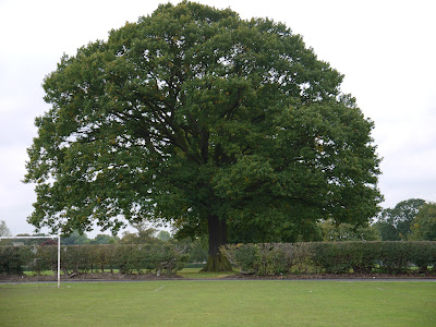
I decided for my school magazine that i wanted to create a logo that would represent Idsall. I chose the iconic symbol of the famous oak tree as the basis for my logo. So i went and took a photo of the oak tree.


I was happy with my image apart from the goal post, so i used fireworks to edit it out. I used the rubber stamp tool to edit it out, i was successful in removing goal post and i think it looks far more professional now without it.  

I then added a circle to the oak tree and removed the excess around the circle. Then i changed the background of the circle to green, i think my final logo works well within my magazine at it incorperates the colour green into my colour scheme.



Magazine front cover


For my preliminary task i have been creating a school magazine front cover and contents page. I have been making my magazine on Pages. I have I started off with a very plain front cover for my magazine, it was full of white spaces so i decided i needed to fill them.


First Edit


Final Edit 


As you can now see my front cover has been changed quite considerably, there are far less blank spaces and i have included a logo that i made on Fireworks. I think my final magazine front cover works far better than before and looks from professional than my first edit. 


Tuesday, 16 October 2012

Picture Editing


Choosing pictures for my school magazine

When choosing the pictures for my magazine i tried to select all sorts of different images that would represent my magazine well. When I took the picture it was quite a bleak day so the clouds were prominent in the picture. So using iPhoto i edited a photo of the school to make it look brighter and less miserable.


Before
The image looks very dark and cloudy.


After
The clouds have been lightened which has changed the whole mood of the image. The image makes the school look more appealing now, this image would work much better in a magazine.


Friday, 12 October 2012

School magazine Mood Board


This has helped me with inspiration for my school magazine. It is useful because I can gather idea's in one place. 

Friday, 5 October 2012

Magazine cover research


This was my original mood board, I looked at  magazine covers instead of the specific images used on them. Even though this wasn't the task set it did help me with inspiration for my magazine covers.

This is link to my Prezi.

http://prezi.com/3b_9n-d2kxqb/present/?auth_key=edh9adv&follow=j621g-xzl1s2

Tuesday, 2 October 2012

School Magazine research


Colour Scheme & Font- For my preliminary task I have been asked to create a school magazine. In preparation for making my magazine I have created a mood board to capture my idea's in one place. For my school magazine I have chose to use the colour blue as my main colour. I think blue is a professional colour and will work well in my magazine. I also need to think about a font to use, I think these 3 fonts are quite basic but they look professional which is the look i am going for. I want my magazine to be an easy read but full of interesting images.


Pictures for inspiration 


Monday, 1 October 2012

School magazine research

School Magazines


Front page:-

  • Logo of school
  • Pictures of school or students 
  • Short information about an article (catches your eye, short, snappy)

Contents Page:-
  • List of different pages divided in subs genres.
  • Small pictures of things to come in the magazine.

Double page spread:-
  • Articles about things happening around the school, eg. School prom or presentation evening
  • Articles about sports achievements or sports awards evenings.
  • Includes: pictures and bold titles